I started writing a critique of designers misusing terms “simplicity” and “minimalism” a while ago. I left the article unfinished. When I got back to it, I started to be skeptical about the whole concept. My opinion hasn’t changed, I still do think that designers are misusing those two words. But the more I think about it, the less important these labels seem. Because that’s what they are: mere labels. So let’s change the topic — and talk about performance instead — and improve user experience of your product.
Simple vs. Minimal
Simplicity is the opposite of complexity. When something is complex, it is difficult to understand. Complexity and simplicity are concerned with the number of features, how to interrogate these features are intertwined, and how these features are presented to the user.
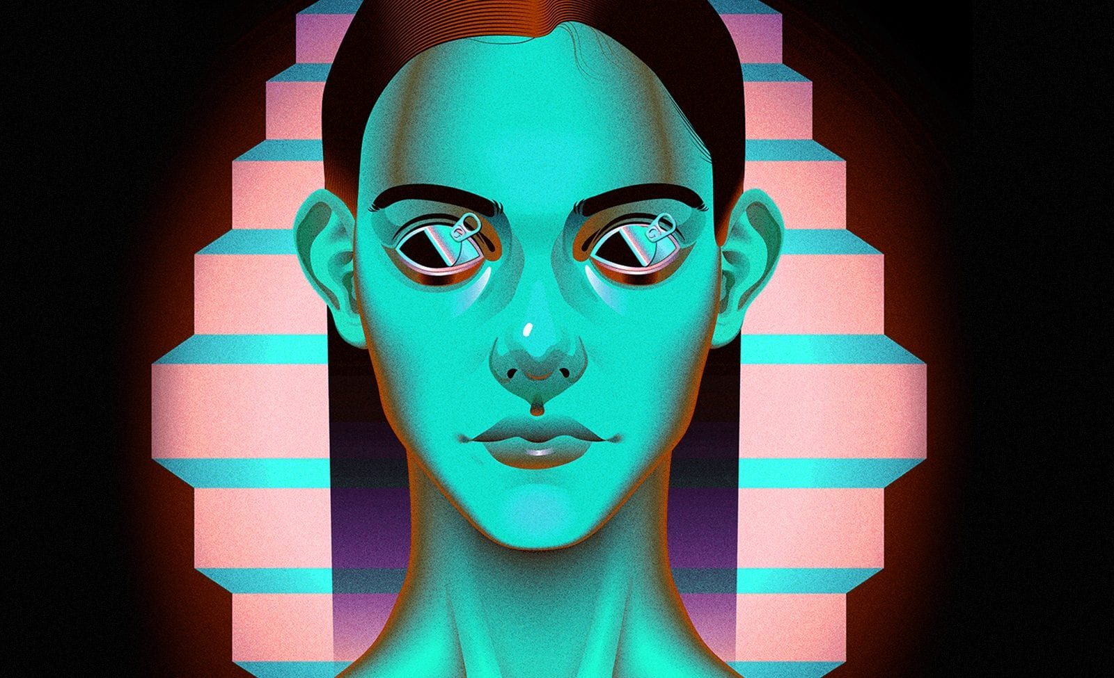
Minimalism highlights the beauty of shape and form, removing any excess detail from the space. It is a form of design — more than just a superficial style. Its goal is to communicate the essence or essentials, to let the user experience purity and elegance. It does this by leaving away all forms of decoration (in that sense, minimalism is not ‘reductionist’ — it is ‘non-additionist’) and limiting itself to basic geometric shapes, honest materials, and clear surfaces.
When I think about a minimalist design the iPod Nano is (still) a good example of minimalist design. It uses basic geometric shapes (two rectangles and a circle) and apart from the Apple logo on the back, the body is free from decoration.
And then there’s the clickwheel. It combines multiple buttons into one and releases tons of features without ever having to lift your fingers once. Now is it ‘simple’ or ‘minimalist’? Neither. It is just very smart and elegant.
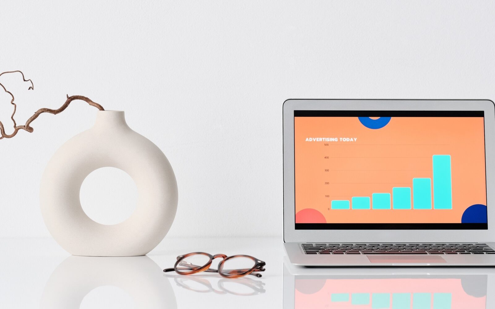
Performance of elegant products
How do you get from a point where: you have a task, that needs to be done — to finished task?
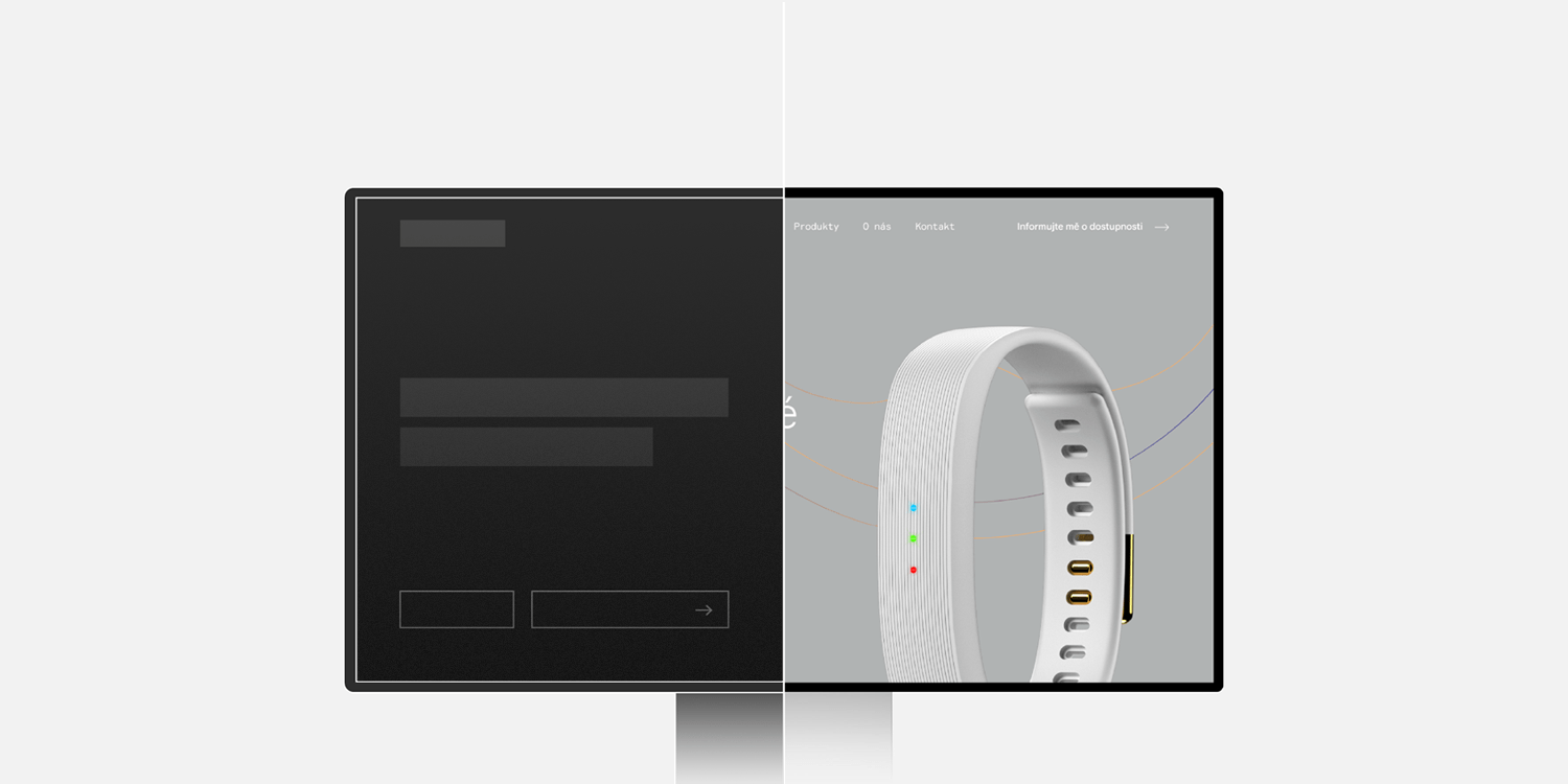
Let’s say you’re trying to make an online payment. You’re typing your card number into a simple form. But instead of manually switching from one input to another, the form is designed so when you fill in all the numbers from the front it automatically continues into next information needed.
Elegant? I think so.
The example I derived from is somewhat outdated. Nowadays it’s not just iPod Nano. The same design principle uses, for example, BeoPlay products or Apple’s magic mouse. And many more, online and offline tools like Flow or Dropbox’s paper. Even Medium — posting articles on Medium is real pleasure after each time I’m posting my articles on WordPress blog or Steemit.
On each of those websites, I need to go through different simple tasks in order to accomplish the same results. But the experience is different.
It’s all about the process.
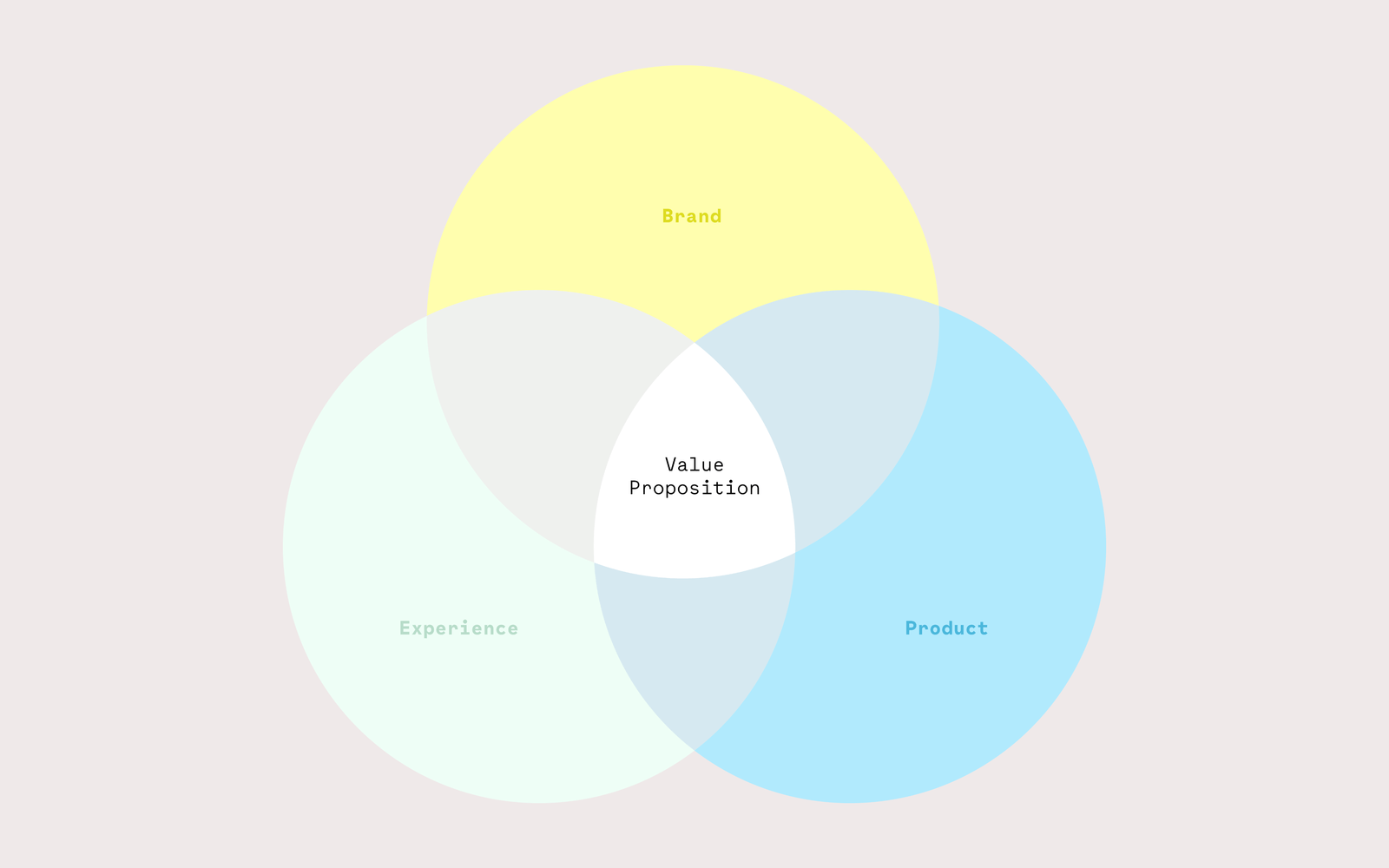
As designers, we’re creating complex, multilayered interactions which are all part of a huge compound process. Simplicity is a standard requirement for (almost) all interfaces. Yet, it’s still not easily achievable. On the other hand, elegance is often more achievable and appropriate than simplicity.
When we focus on developing elegant solutions, we focus on the performance. On the flow of the user from having a problem that needs to be solved to solution.
How to strive for elegant user experience solutions?
1. Be aware of oversimplifying your work
Looking for the perfect aesthetics, we’re compromising the usability of a product.
In our research phase, we might slip down to confirmation bias. What it means? Basically, instead of testing a hypothesis we tend to try and prove it through selecting data from our research which does just that. By following our own beliefs, we devalue the whole research.
Rather, we should want to find out what is really happening. And alter our product’s experience based on our findings.
2. Don’t create an environment without challenges
A challenge naturally triggers people. We need to feel like we have accomplished something.
Behavioral psychologist, Susan Weinschenk stated in her book that this kind of environment is non-engaging and doesn’t ensure the feeling of control. Which is crucial for human beings. People, generally, want to know what’s going on and that they’re in charge.
3. Design for trust
Keeping the important information exposed, having a constant feedback on what’s going on or paying extra attention to user actions that are irreversible — those are just a few of the fundamental principles that were still applied in the past. And they still do apply.
The future needs elegant solutions
The blockchain is relatively new technology to which almost everyone is new. While everyone is excited about the new powerful possibilities, designers are behind the scenes, strategizing how to humanize it. Its proper mass adoption will take time and dedicated efforts to translate it. And make it elegant for the users.
And it’s not only about Blockchain. Siri and other voice assistants are predicted to be our inseparable counterparts in the near future. Some companies are already bored by Alexa and Siri. What they see as the next big thing? Your gestures.
How should we design elegant solutions for these technologies and usecases?
That’s a question every user experience designer will have to solve. Minimalism for the sake of minimalism doesn’t make sense — it’s just a style. Nor does simplicity for the sake of simplicity makes sense. But to design something elegant, which often will be minimalist and simple, is a goal for which I always strive. And I think, you should strive too.