Case study
Transforming
fintech via design.
The name Aavri comes from the Greek word Avrio which means “the future”. Aavri is a digital service design & deployment company which helps financial institutions transform their company’s digital channels.
Soulmate’s focus was to help Aavri better position themselves as an established company that financial institutions would trust.

Challenge
Our research evolved around few crucial questions: How do we showcase years of experience, yet still look fresh and exciting with a hint of novelty? How do we look classy without being too rigid? And how do we create a look that will last while still allowing it to be easily updated?
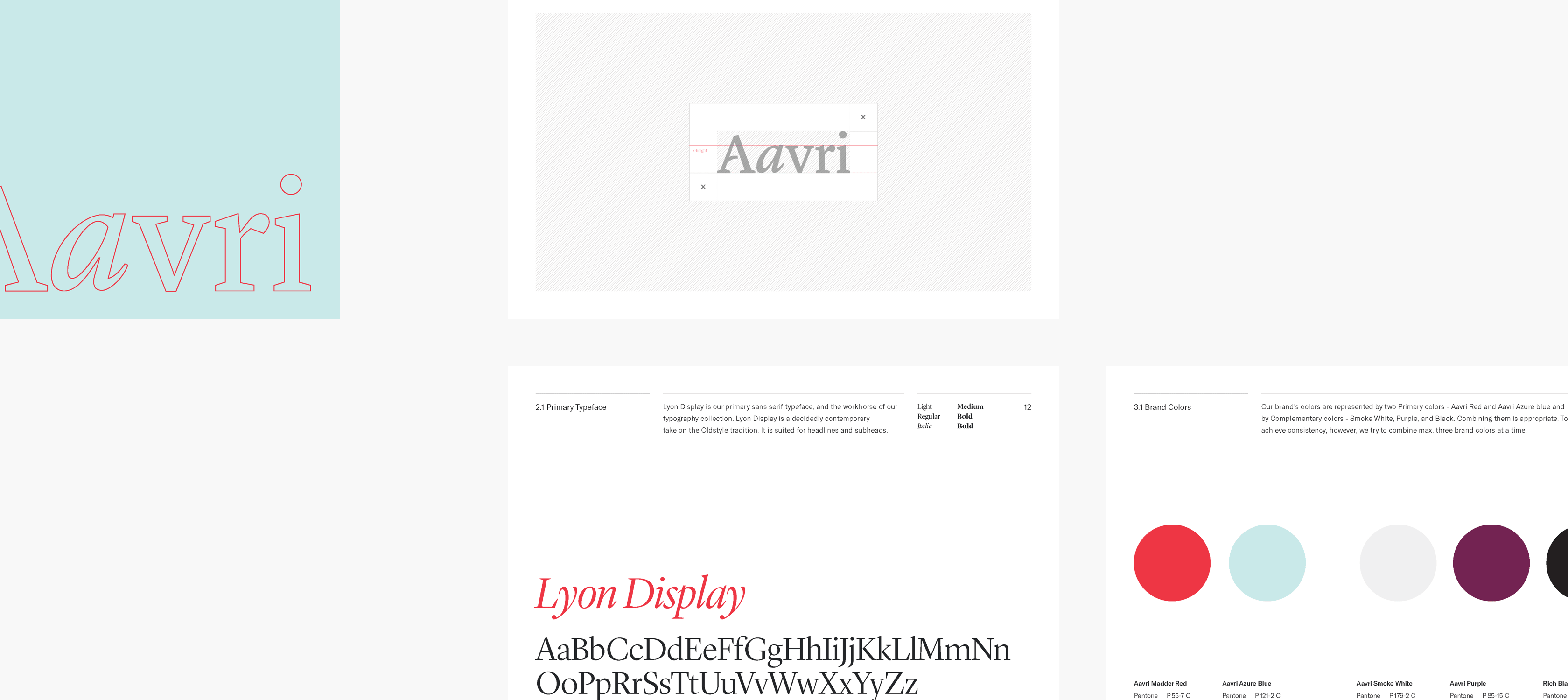
Emphasis on the details
Just as Italics (in typefaces) are a way to emphasize one’s key points or show which words are being stressed, Aavri’s logo is an emphasis of their vision and mission. We combined the Regular and Italic “Aa” as a reference to the old sitting beside the new – The traditional financial institution and their alternative future with Aavri.
Being traditional in the digital world
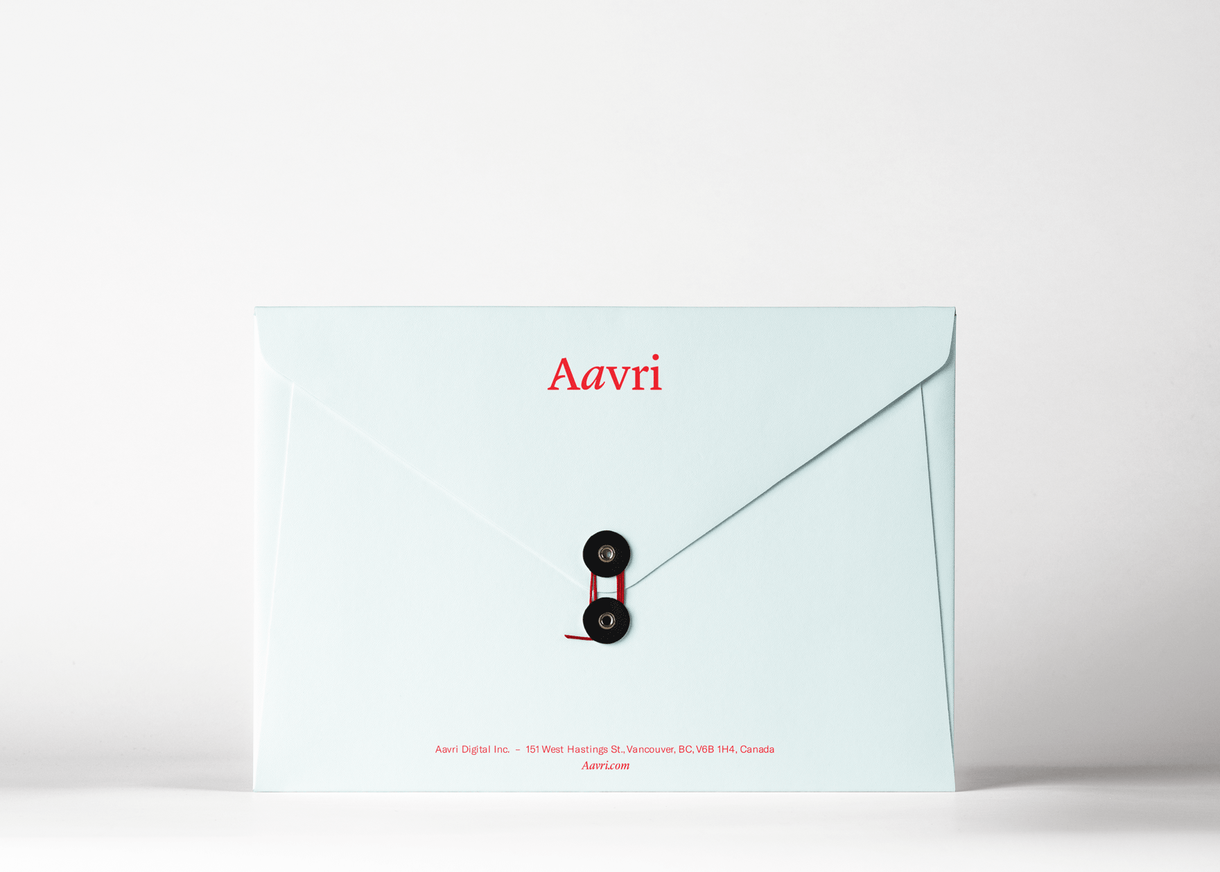
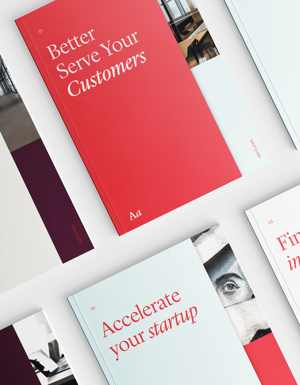
Aavri wanted to help their customers build their own new digital future. Yet, their focus on conventional financial institutions made our design choices more conservative. The result? A clean and cohesive identity that was completed with a combination of bright and pastel colours, distinctive typography and minimalistic illustrations.
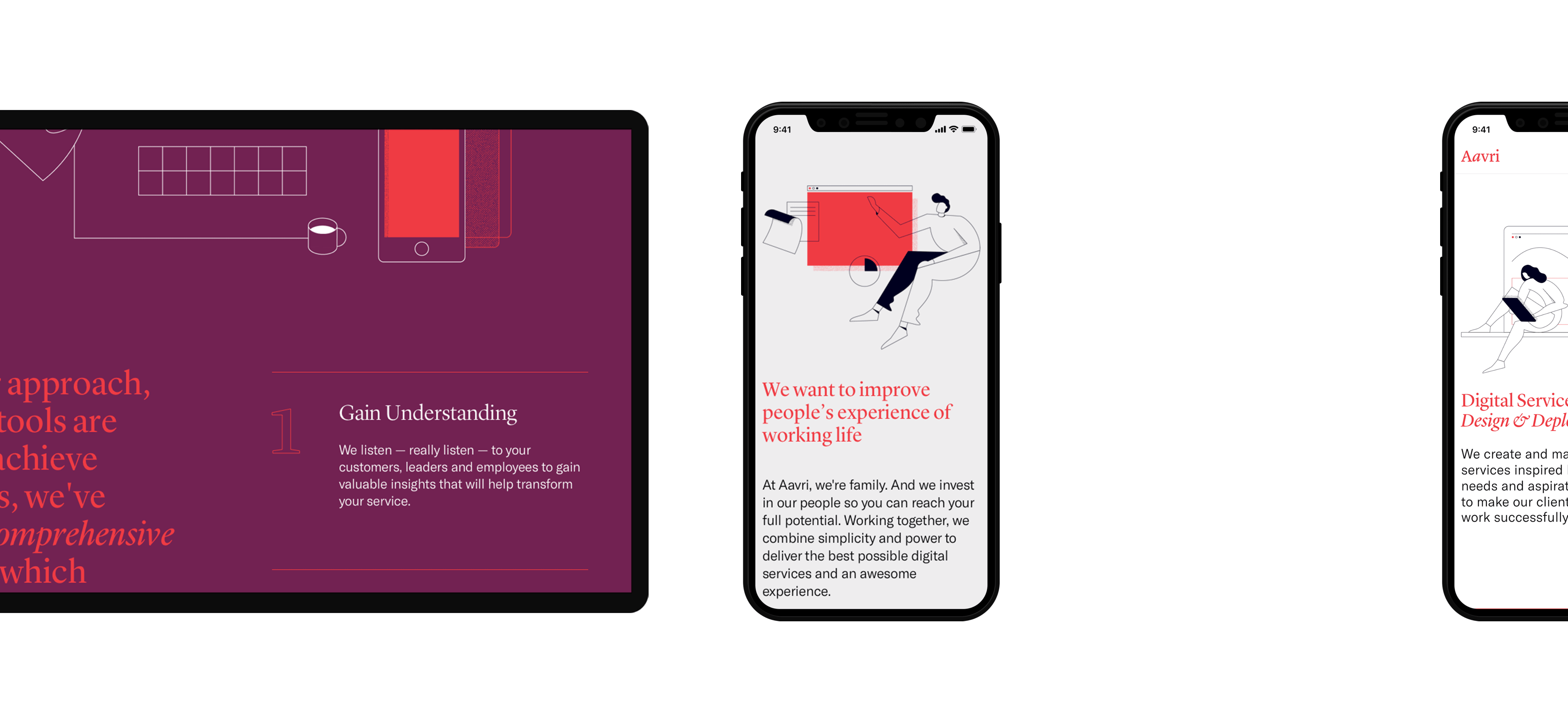
A natural visual rhythm emerged when we aligned a strategy with the right type, colours and illustrations. The key to Aavri's identity was in finding the right balance, until we were able to communicate everything they stand for, without saying a word.
-
Strategy
Research & Insight
Goal-Boosting Workshops
Brand Strategy -
Design
Art Direction & Brand Design
Visual Design
Illustration concept
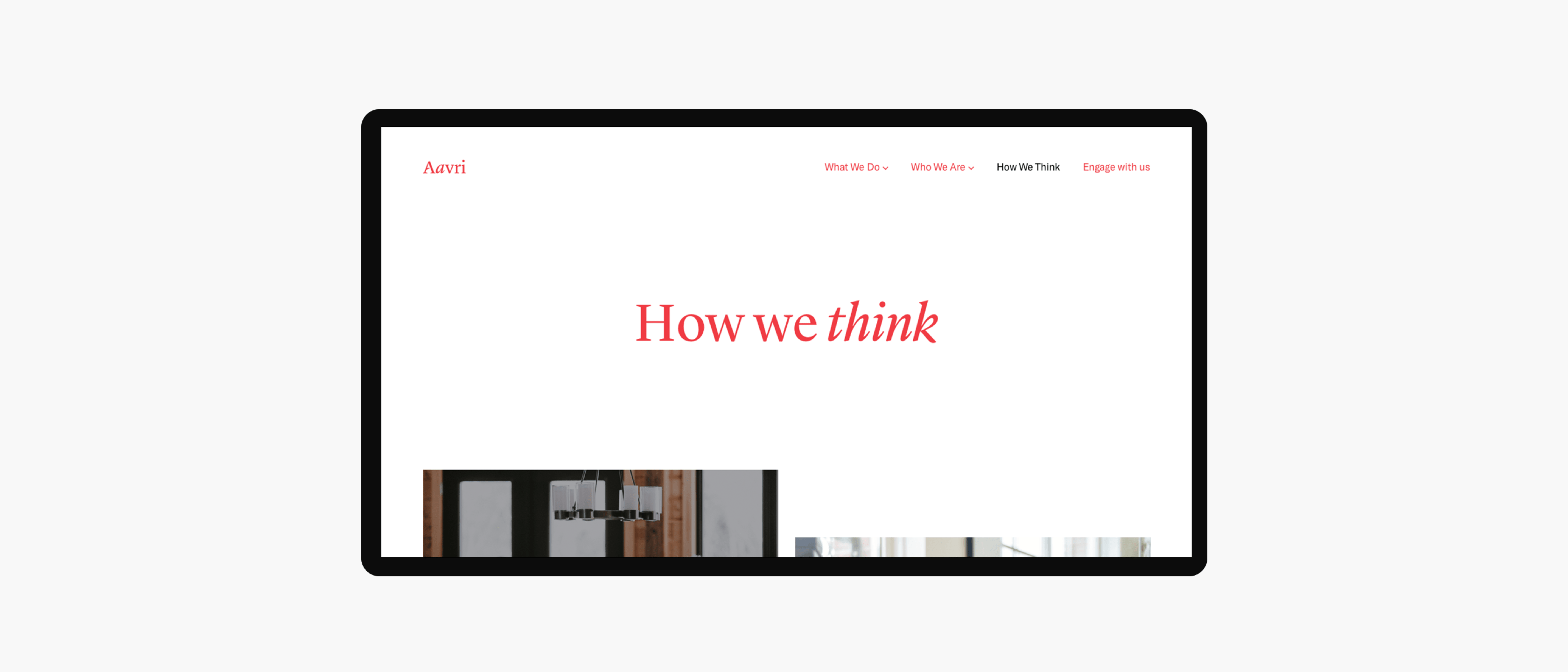
Website UX/UI -
Production
Content Production
Illustrations
Website Development -
See if we can build your new project. Talk to us.