Case study
Ready to be a rockstar?
Tunefox is a web and app based learning tool designed to help people learn bluegrass songs and licks for guitar, mandolin, bass and banjo.
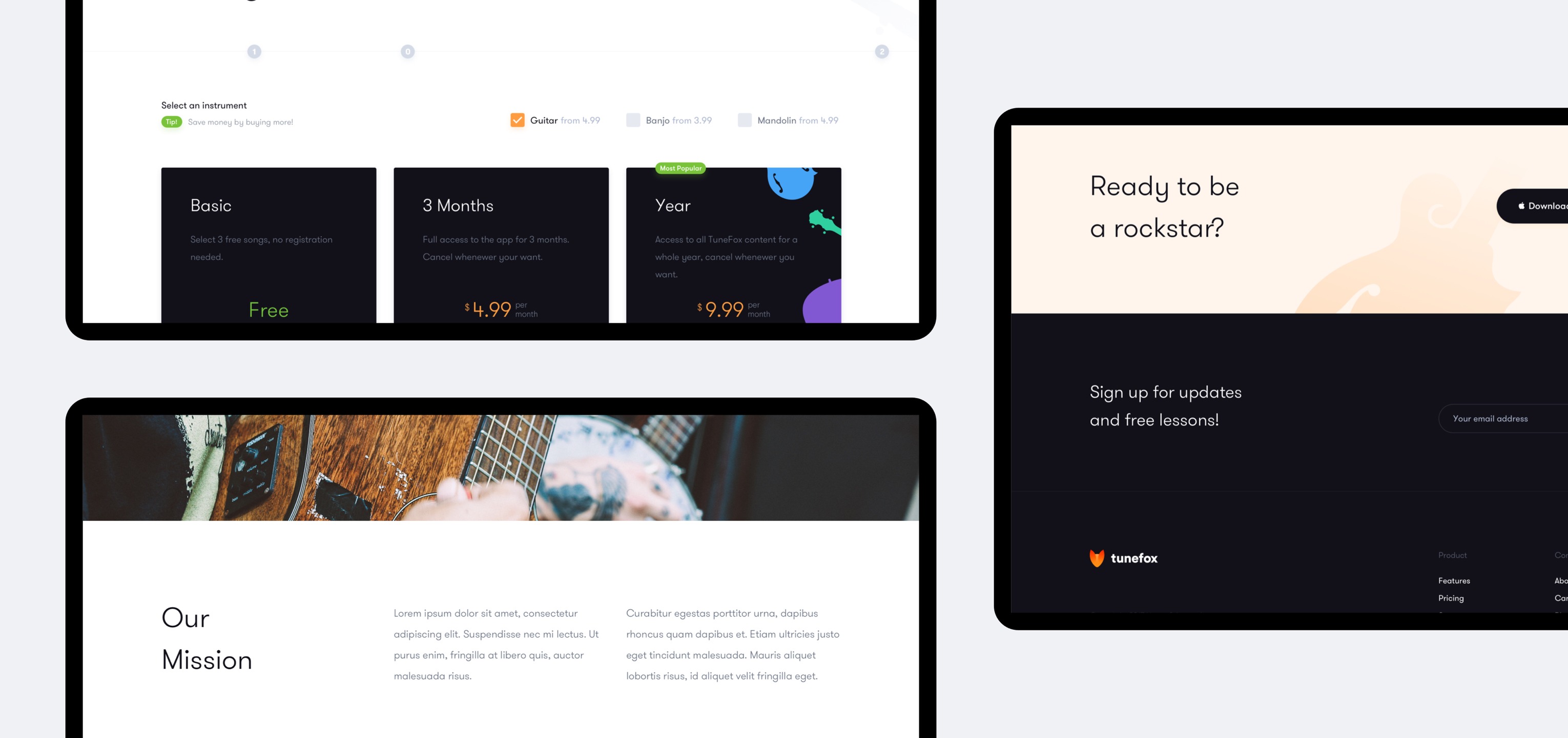
We worked with the Tunefox team to design a striking visual brand and rebuild their app to better serve beginners and rockstars alike.

Tuning in
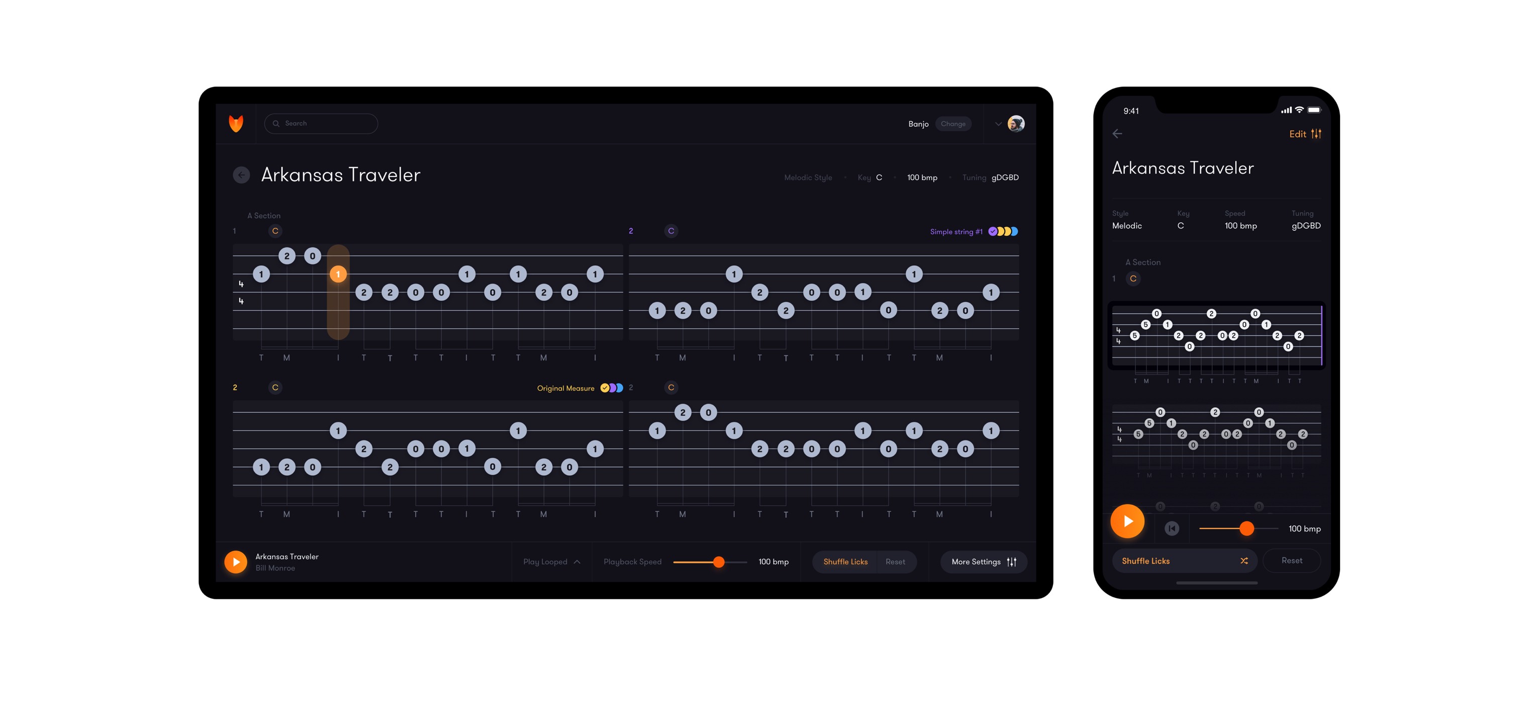
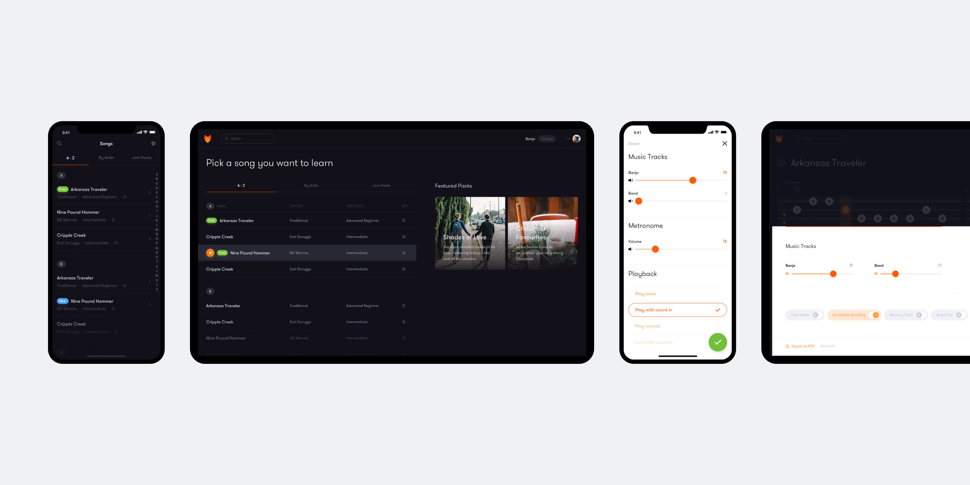
Early on in the process, we worked with the Tunefox team to outline a strategy around what kind of guidance musicians would need, and at which points during play they would need it. Then, using that strategy, we re-shaped the entire user experience and created a brand-new desktop app.


From anonymous to a brand
Tunefox’s built-in practice tools let users explore their creativity whether they’re inside or outside of the practice room, and on any device. To visualise this variability, we created a simple yet recognisable identity with vibrant logo, pastel colours, note-like patterns, and custom iconography.

Designed for your 10 000 hours. Mastery takes practice. Designed with users in mind, we chose a dark layout for the app’s interface. This way, a user can practice for longer hours without hurting their eyes.

Anywhere, anytime
The unified cross-platform experience can be easily updated by adding new songs or instruments, and personalised to the user’s liking. We also added features such as switching licks, hiding notes, and jamming with backing tracks to create a truly diverse, engaging experience.

-
Strategy
Research & Insight
Brand Strategy -
Design
Branding
Visual Design
Brand Guidelines
UX/UI Website
UX/UI Desktop & Mobile Apps