Case study
Automates any workflow on the web.
Apify is the place to find, develop, order and run cloud programs called actors. Use actors to scrape web pages, process data or integrate web apps.
Apify is a software platform that enables forward-thinking companies to leverage the full potential of the web—the largest source of information ever created by humankind.

Challenge
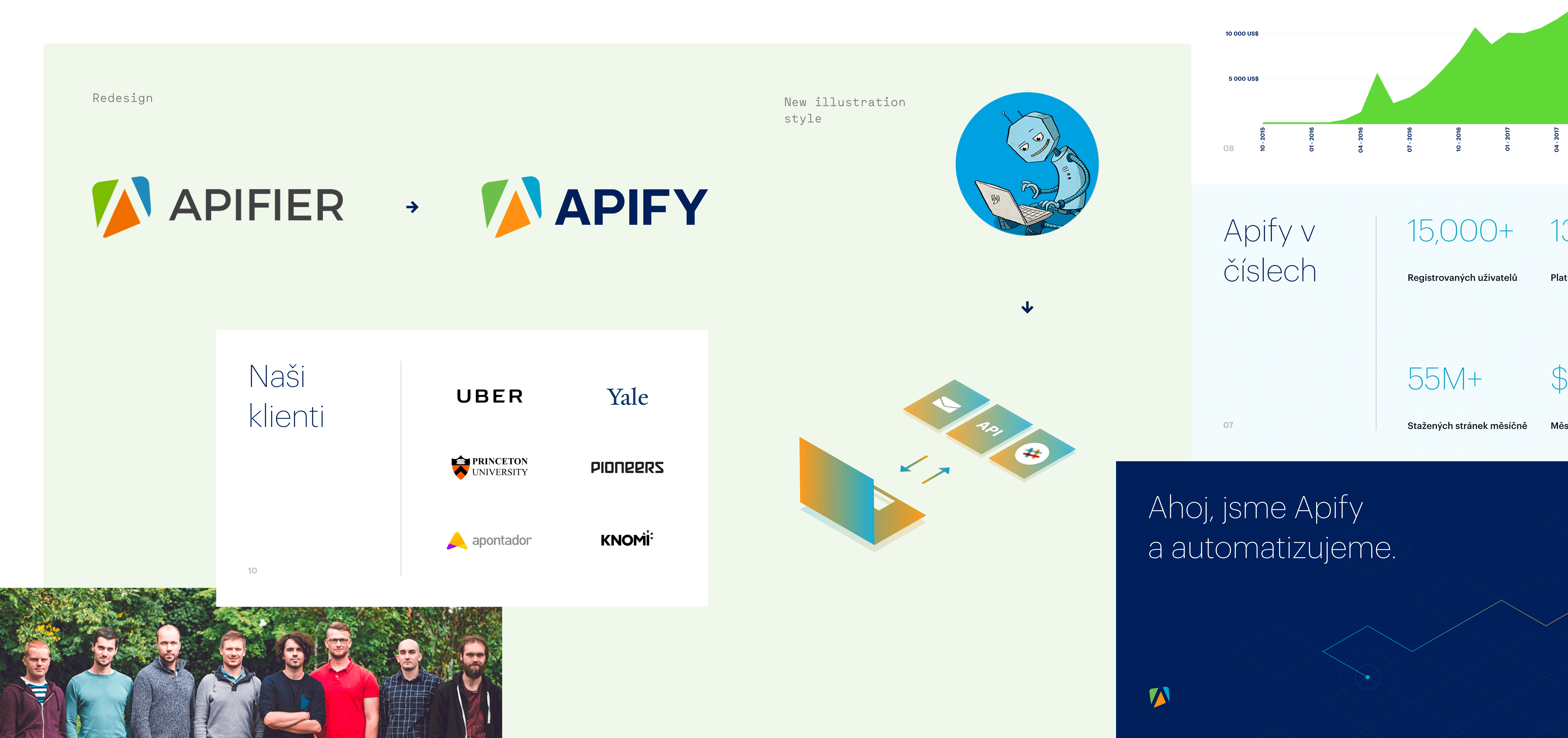
We’ve been tasked by the Apify team to redesign their logo as well as to use new naming, visual identity and unify their visual language across multiple touchpoints.


Brand Redesign
Although it might look like a minor update, it’s had a huge impact on the visual form and design system Apify used. We’ve refined the symbol, to make it cleaner and more pixel-perfect for use in digital. We cleaned up the typography to make it more suitable for future applications.
New Apify
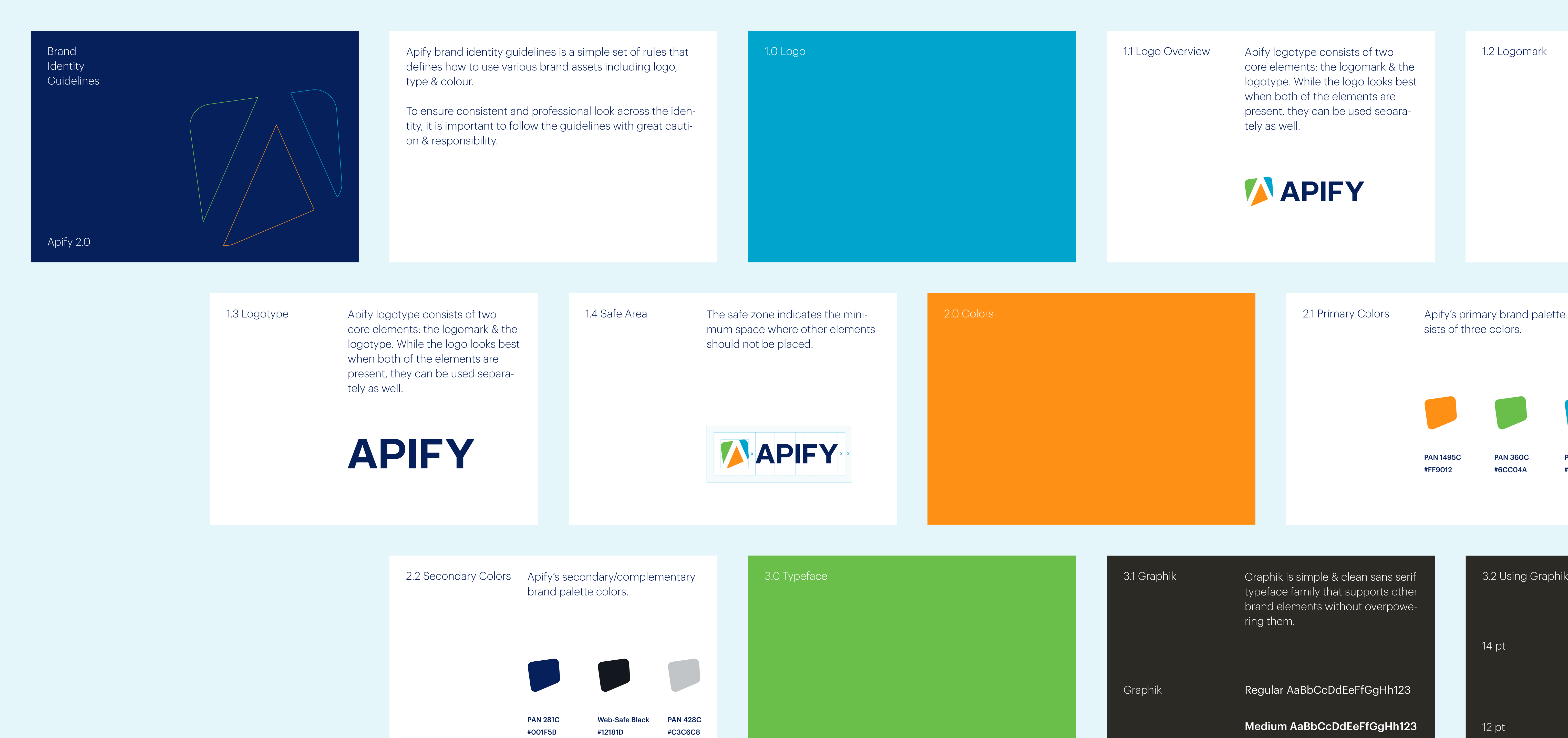
As we made all these changes, we wanted to be sure that the Apify team will use them accordingly and respectfully, so we prepared a brand manual with all the necessary updates and made them easy to find.
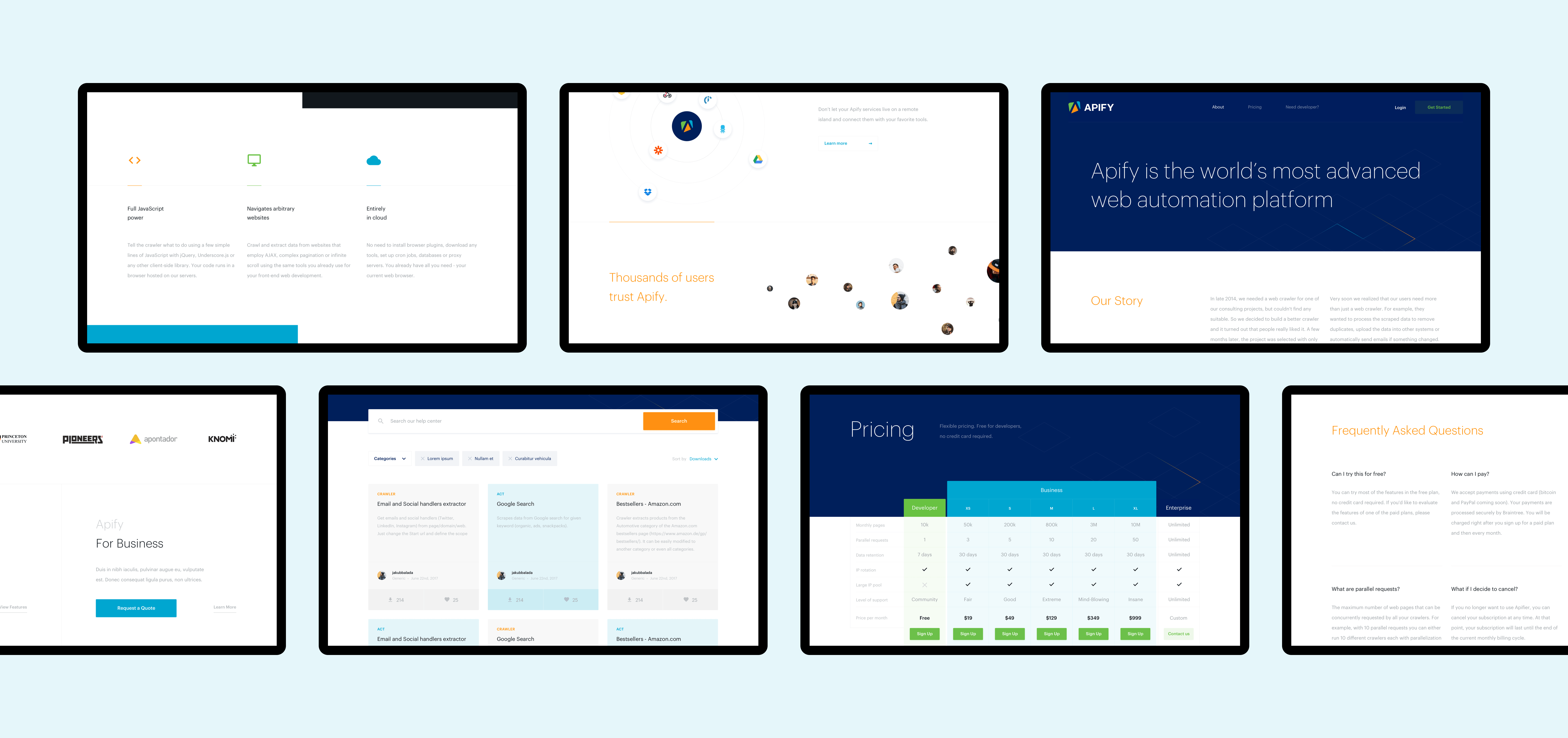
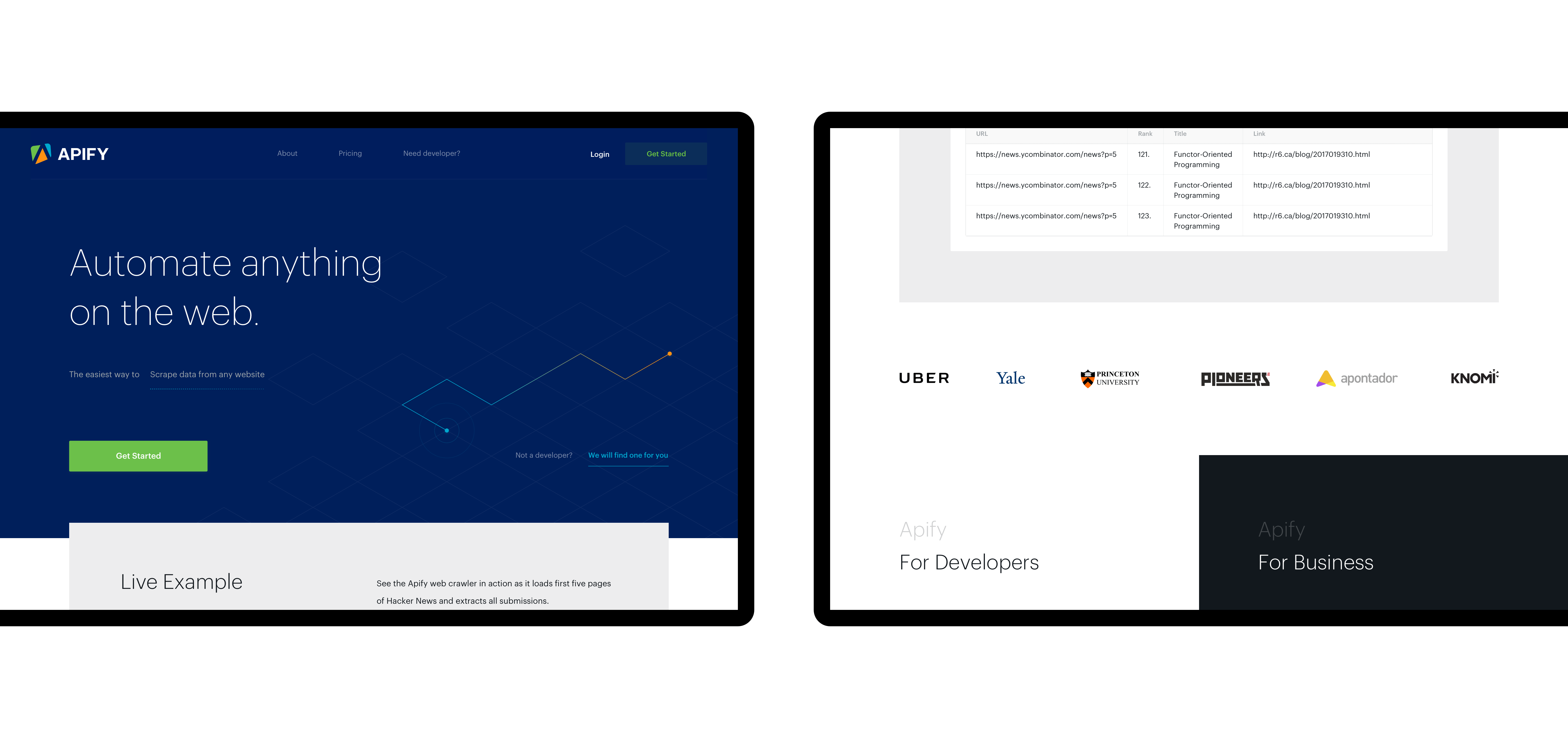
It was challenging to create a website for developers, as we need to understand the product properly, but we managed it at a glance and the client was surprised by the outcome.
Just getting started
Once our tasks were successfully completed, the client was extremely happy with the design and development we provided. But we still had a couple of things to do, such as implementing the same design language across the entire platform.
Success
The team at Apify is now constantly evolving the language that we set as a basis for their new era, which is a rewarding experience for us! They recently received recognition not just from their users, but from investors, as they’ve been fortunate to raise millions since.
Visit https://apify.com
-
Strategy
Research & Insight
Brand Strategy
Communication Strategy
Technical Strategy
UX Strategy -
Design
Creative & Art Direction
Branding
Visual Design
UX/UI -
Content
Photography Direction
Illustration
Copywriting -
Development
Prototyping
Front-end Development