Case study
Bespoke crystal glass installations.
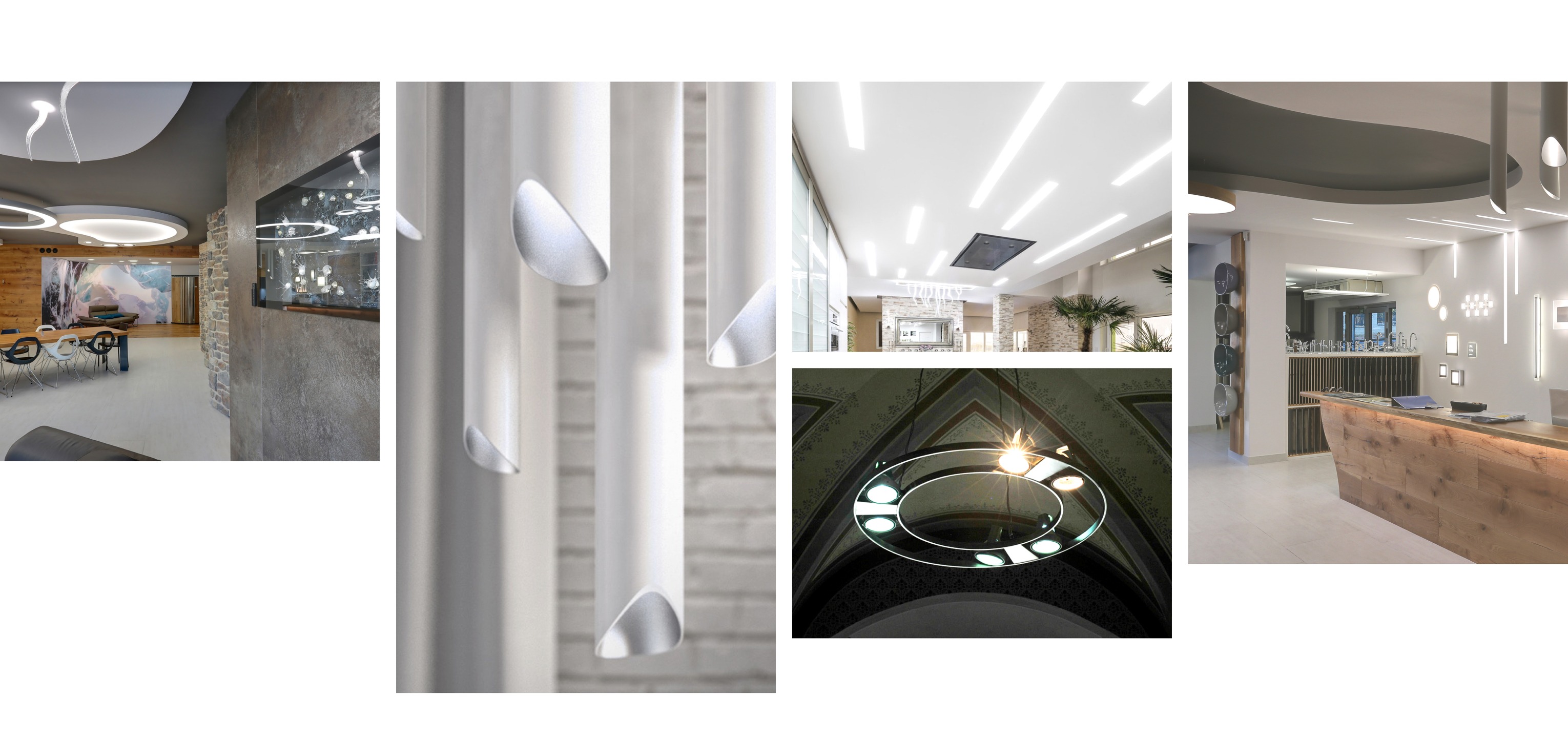
LuxLightning create unique, tailor-made glass lights and design interiors, bringing warmth into each space with their bespoke light fixtures.
Our team helped this Bohemian design company shine a new light on their identity and digital presence.
Challenge
With over 10 years of experience in the Czech market, LuxLightning lead the way when it comes to designing interiors and light installations. After our initial strategy session, it became clear that there was a dissonance between their modern products and outdated communication. We asked ourselves “How do we redefine this status-quo?”.
Illuminating aesthetics
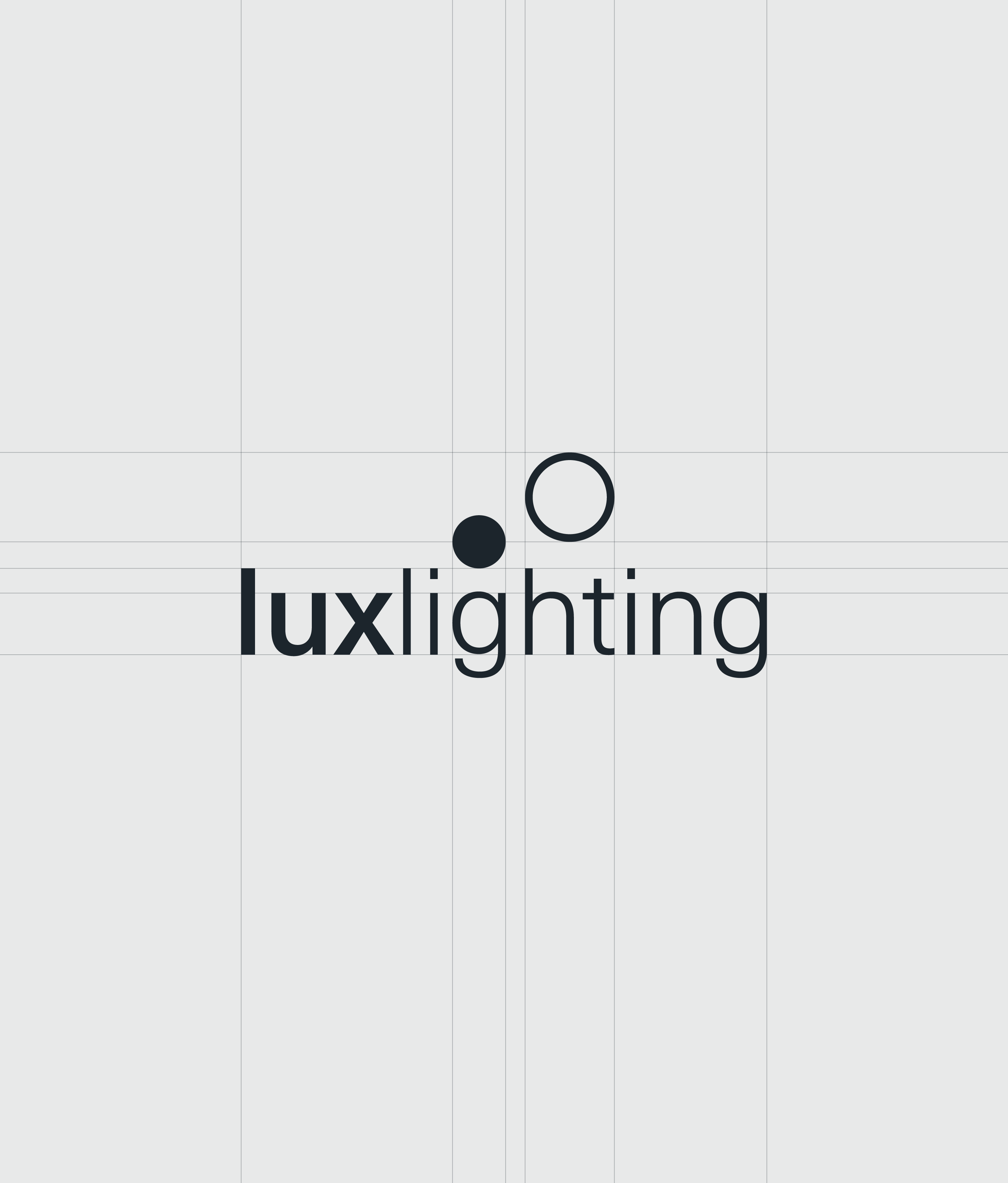
The brand’s refresh began with completely re-defining their visual identity and communication. Inspired by the illumination effect that light creates, we designed a new simple logo that perfectly compliments LuxLightning’s beautiful designs.

Presenting the full picture
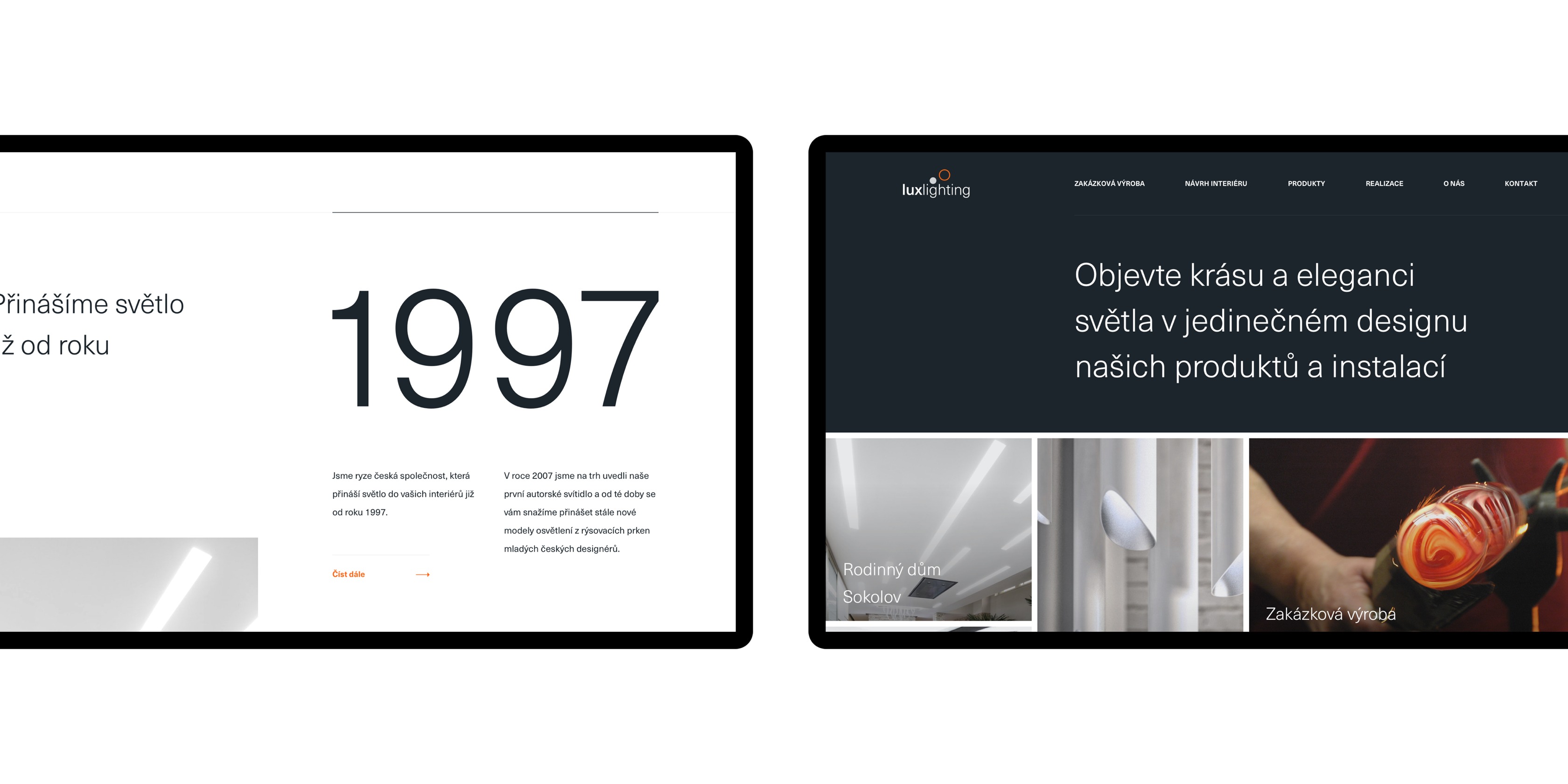
Lighting is the interaction of light, space, and colours, just like a website is an interaction between user, content and the device. To communicate this, we rethought the entire digital strategy, adding some all-important web architecture. The new web design thoughtfully navigates the user through the full spectrum of their capabilities, as well as their products.
We made a pact to make our work stand out and merge the quality and uniqueness of it, using a website, that will represent just that and also will be functional easily, so everyone here can manage it.
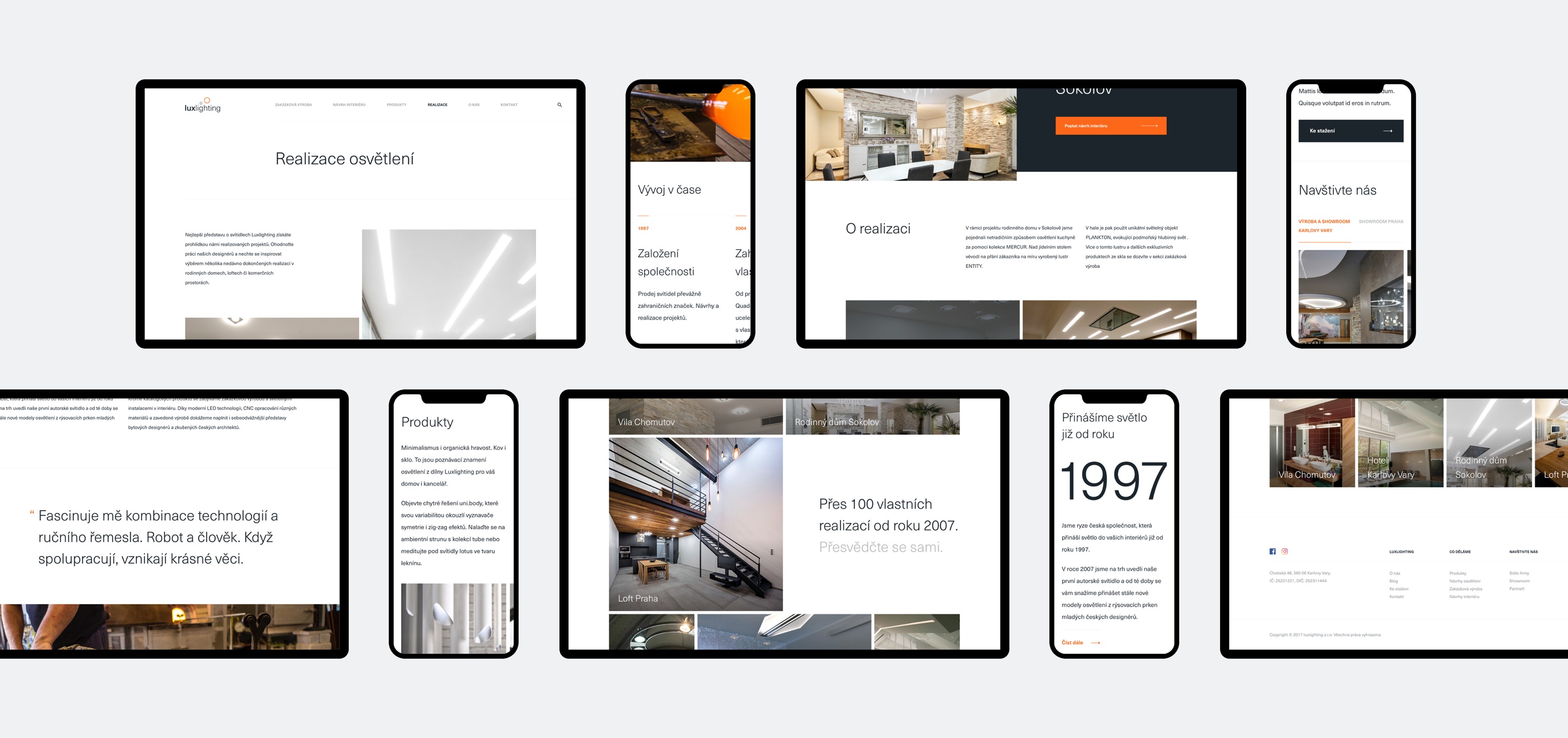
Visit http://luxlighting.cz
-
Strategy
Research & Insight
Brand Strategy
Communication Strategy
Technical Strategy
UX Strategy -
Design
Creative & Art Direction
Branding
Visual Design
UX/UI -
Content
Photography Direction
Illustration
Copywriting -
Development
Prototyping
Front-end Development