Case study
Use the money whenever you need it.
Twisto helps their customers to be agile when paying for common things like food, clothes and many others on the web or in real life using cards.
With Twisto, you can buy things more than 14 days in advance of payment so it doesn’t affect your personal cashflow and can help you understand money better.

Challenge
As the creators of the company’s previous logo, we were approached by the Twisto team, specifically Lukáš Hurych, to redesign their logo, to create a visual identity and to unify the company’s visual language across multiple touchpoints.


Redesign itself
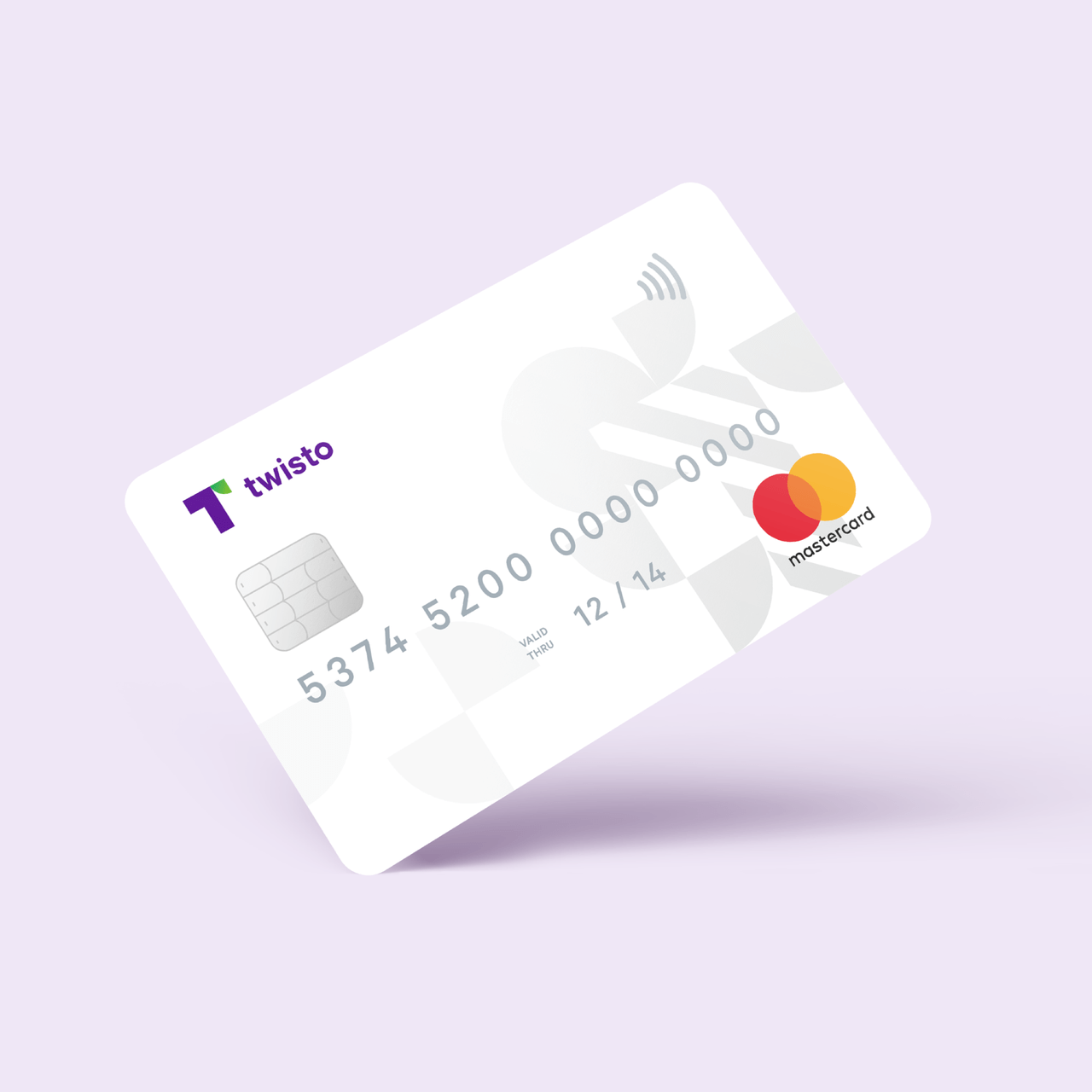
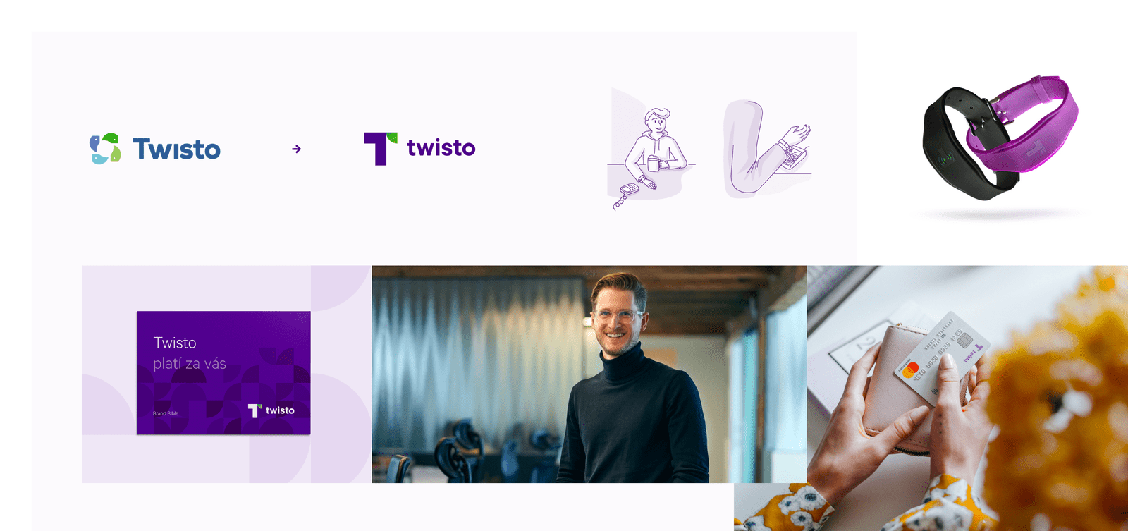
As you can see below, the task was straightforward: let’s make Twisto look like a brand rather than like a little company, something that will stand out in a crowd of logos and be instantly recognizable. Another request was to make the logo easy to reproduce on various types of material, such as nfc bands or credit cards.

Refreshed Twisto
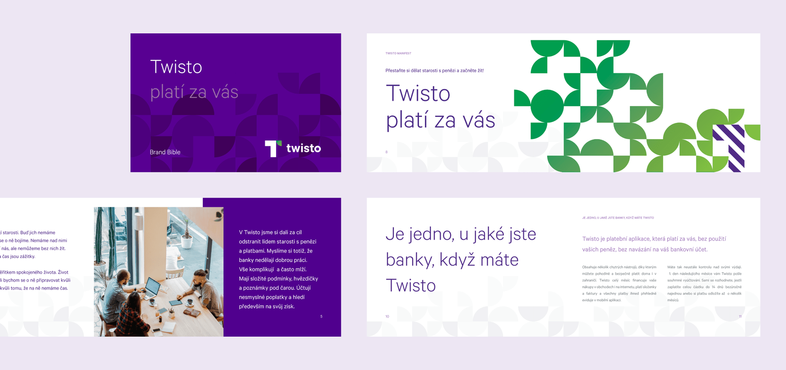
While the redesign went as planned, we’ve been asked to make other bits of corporate identity such as brand manual and miscellaneous stuff for the company: business cards, letterheads and other print and digital materials.

It’s always a challenge to create something iconic in such a short period of time, as the deadline was extremely tight, but we managed it well.”
Success
Twisto was a huge milestone for our business and our hard work and dedication was a huge milestone for theirs. Our brand identity made them visible and trustworthy, which was the main goal according to the brief we received: let’s make the Twisto logo visible, recognizable and flexible to use.
Visit https://twisto.cz
-
Strategy
Research & Insight
Brand Strategy
Communication Strategy
Technical Strategy
UX Strategy -
Design
Creative & Art Direction
Branding
Visual Design
UX/UI -
Content
Photography Direction
Illustration
Copywriting -
Development
Prototyping
Front-end Development